 For quite some time now I’ve been aware that the layout of our resource pages could stand to be a little easier on the eyes. Yes, the content is GREAT, but wouldn’t it be nice if it was also visually pleasing?
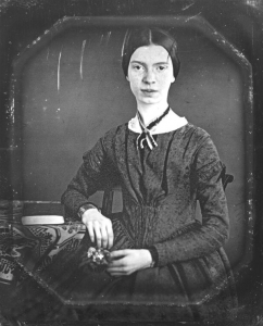
Well, I’ve been thinking about this, and recently got to work on it while putting together our Emily Dickinson page (because YES! we are working on poet study collections too! Should be ready in August!).
Want a peek? Come see what I’ve done. Over the next few months I’ll be working my way through every resource page, converting it over to this beautiful new layout, PLUS I have a user guide/suggested schedule that I’m working on for you as well! So, basically there will be two BIG upgrades coming to all collections this year! This will be at no extra cost to you, it will just make everything that we have better than ever.
What do you think? Do you have any suggestions that could make it even better? I’d love to hear your ideas.




This new layout is awesome! I’m a visual person and this really makes sense to me; so easy to find the specific resource.
It looks really great and so easy to navigate quickly.
I love how organized it is- I have such a hard time focusing when things are scattered all over. This makes it so easy to find what you’re looking for. Great job!